Concept
My work with Face to Face Games has spanned several smaller projects, each was a little too small for its own page so I've collected them all here. Face to Face is the largest tournament organizer in Canada, and many of the designs for them are associated with their cross-Canada tour series. Either as part of their prize wall or as part of their event perks. Notably while most of my work for Face to Face Games is compiled here my Canadiana Critters playing cards project has been splintered out as it's a larger project.
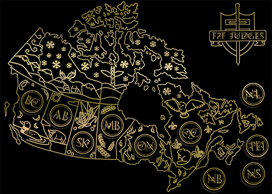
Canada Map
Another thing I was tasked with was making a judge gift for judges that frequently worked for Face to Face. Because they run a Canada-wide tour they wanted a plaque they could give out and then when a judge worked an event in each area they'd get a little circle sticker to put on it. I originally designed it as a gold-on-black design, but when Face to Face checked the price, that much black ink was going to cost significantly more, so we swapped it to black-on-gold at the last minute.
 Original Design
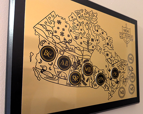 Final Produced Plaque
Later they said they liked the design a lot but wanted a reworked version for a playmat to distribute in the Regional Championship Qualifier kits. Which are kits that allow stores to run qualifiers for the tournament to determine the best player in Canada. The playmats would be given out to the winners of each qualifier. Overall reception was mixed, typically the artwork for the RCQ playmat was a piece of official Magic: the Gathering artwork, however due to a tighter shipping deadline in Canada, it's very difficult for Face to Face to get the rights to the official artwork in time to have playmats produced. It was interesting to hear about the reaction to the playmats at RCQs, because as a prize wall item at the booth they consistently sold out. Another interesting piece of feedback was the fact that corn isn't actually grown in Saskatchewan! What an egregious oversight! When Face to Face mentioned they'd be running the mat again, I said I wanted to fix the inaccuracy! I moved Wheat over to Saskatchewan and gave Manitoba the sunflower design, since they're known for their exports of sunflowers.
.png) Corny design
Corny design.png) Less corny design
Less corny designMetal Shirt
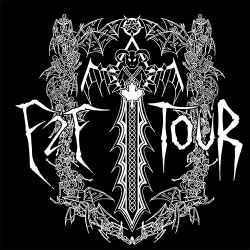
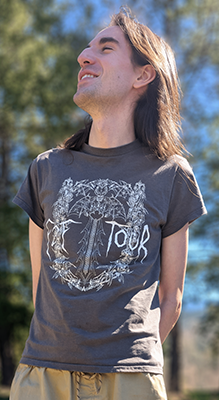
One of the things I was asked to produced was a "metal-style" t-shirt for the Face to Face tour prize wall. I haven't done anything like this before, so I poked around for inspiration and decided that I wanted something similar to the "heavy metal" dark ritual shirt design Magic: the Gathering did. I also knew I wanted to heavily incorporate the face to face logo into the design.
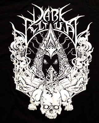 Heavy metal shirt produced by Wotc for Kaldheim
 Face to Face logo
This meant strong white constrast with skeletons, demonic overtones and probably a sword in there somewhere. I started with the basic "shield" design of the Face to Face logo and worked around that. I haven't drawn skeletons in a while so it was a bit of a learning curve, I decided that in the middle the sword hilt should be a stylized demon. I also played around with various styles of type, first trying a few of the more stylized and characteristically unreadable heavy metal looks, but eventaully settled on the bones that you can see in the final draft. Notably, I handed in the design but it wasn't used for a few months until Spotlight Toronto when Face to Face reached back out to me about making a matching shirt back design. When I went to re-send the final files I noted that the central demon looked a bit... cutesy. I decided to make a few revisions and see if they would be okay with an updated version where the demon was gnarlier and the visual hierarchy was a bit clearer. in the newer version the text really pops whereas in the old one it was competeing with other bold white elements for focus, and ends up making a less readable design.
 Initial Shirt Design
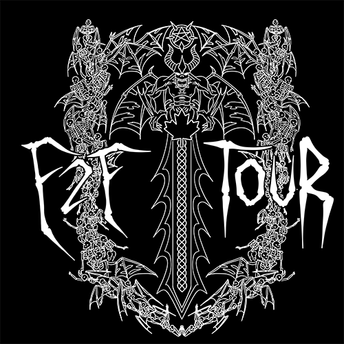 After Revisions
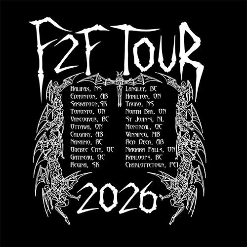 Shirt Back
Overall reception was positive, many sizes of the shirt had sold out by the end of Spotlight Toronto. One interesting thing was they made the shirt base grey instead of black (they mentioned already having too many black shirt designs on the prize wall. I think I might've gone for a black design if I knew it was going to be on a light grey shirt, but I still think this one came out okay. I was glad I got to touch up the design a bit, since I wasn't super happy with the initial one.
 Shirt Front
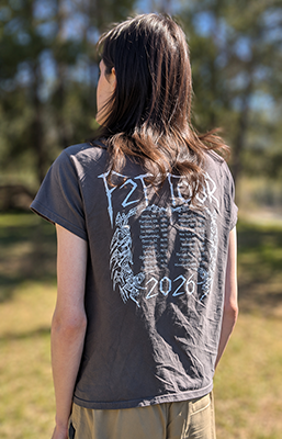 Shirt Back
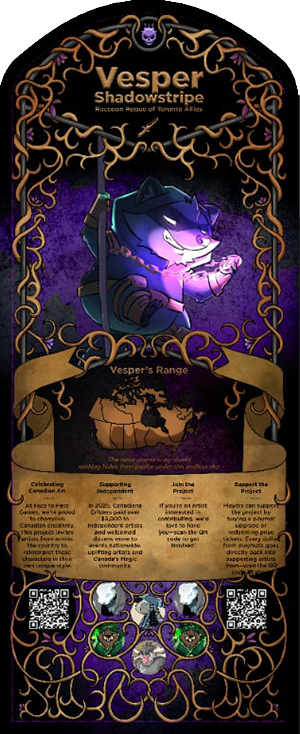
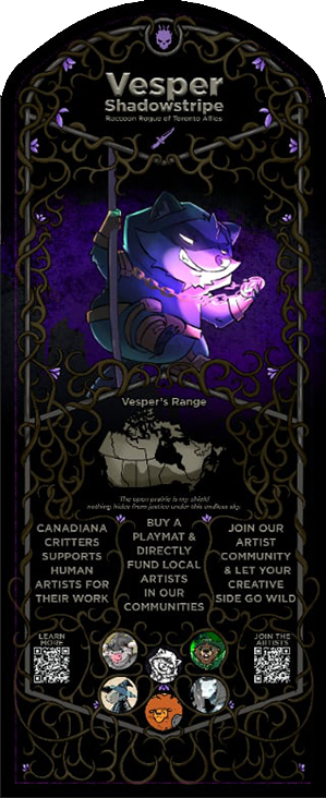
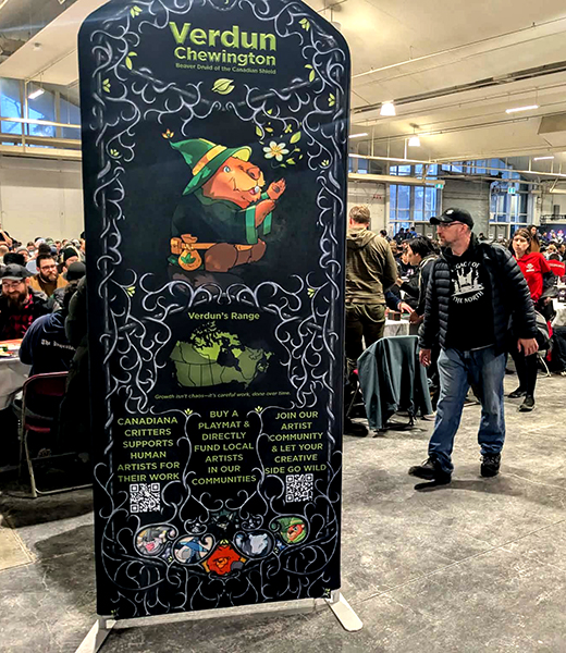
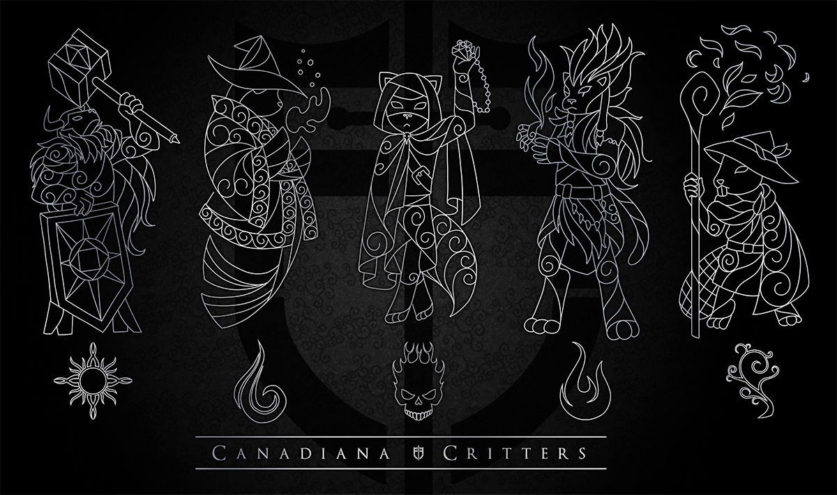
Canadiana Critters Banners
One of the larger jobs for them was a set of large 15 foot tall standing banners advertising their animal mascot characters the "Canadiana Critters". The featured artwork was by Burnt Coffee and I was tasked with the frame and layout design. Face to Face has a long history of supporting artists, and wanted this on full display for their largest show of the year. This was a pretty challenging project, I've never designed for large things before! It's always been very small things. My first few revisions reflected this, my text was too small and the whole thing was a bit fiddly.
 Initial Sketch
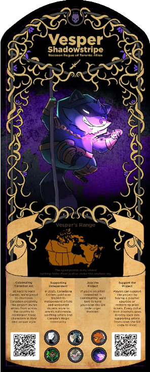 After Revisions
Luckily Face to Face was willing to work with me and let me know that the bottom third of the banner needs to contain basically no information, since most people won't see that part. I made the banner smaller and filled in more of the filigree down at the bottom and tried to incorporate the other artist images into the design. Face to Face also mentiond that the text should be chunked a bit, but I wasn't sure how much I would be allowed to cut, so I leaned on the fairly conservative side of things. Turns out this was still too much text, so I tried an agressive condensation next!
 Text in sections
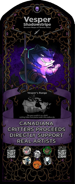 LESS TEXT
Finally I realized that the large clunky banner just wasn't working and I dumped it, we reworked the text again and I played with the brightness of the filigree elements, since felt like they were detracting from the character which was the focal point of the image.
 Getting closer
In the final revision I changed the circles of artwork at the bottom to a more organic shape, and added even more artwork in. I had to upscale and draw in some pieces of the original Burnt Coffee artwork, since it was never meant to be this large. I also organized the layers so that applying a colored overlay was easy for each character. After seeing it in person I think I should've made the filigree elements darker, they're a bit bright. Also the leading between the lines of text at the bottom is a bit large, I think that could've been condesnsed a bit as well. Overall I'm still pretty happy with them and was grateful for the opportunity to work on them!
 There it is!
9th Place Hoodie
Most events are of the structure that players will play some number of rounds against other players and then the tournament will take the X number (usually 8) of the top performers and put them into a single elimination bracket. Making top 8 is pretty important beacuse that's how you get a crack at the grand prize.
One of the unfortunate side-effects of the Swiss tournament structure is that in many events, two players might have the same record but one will make Top 8 and one won't. How does the software determine who makes it? A system called tiebreakers, quite reasonably, a bunch of statistics to fall back on in the case where two players have a tied record. The main one is Opponents' Match Win Percentage, which is what it sounds like, the percentage of matches their previous opponents have won. In practice, this means whether players make the top cut isn't just about their record, it's also influenced by how their opponents perform afterwards.
This is all to say that some players will be stuck in 9th place which is a pretty crappy place to be. There are also some players who frequently perform well but end up in ninth a lot (which is honestly a mark of a pretty decent player seeing that even pro players only win 60% of the time in Magic). To alleviate the feeling of "just missed it" and also play into player culture a bit Face to Face wanted a hoodie that proudly displayed a 9th place ranking, only given out to players that ended up in ninth at a major event. This was a pretty short and easy project with basically no revisions.
Spotlight Toronto Passport
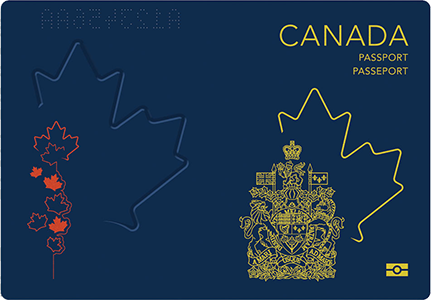
Another thing I worked on for Spotlight Toronto was the passport. This one had a pretty crunchy timeline, of about four days. The job was a bit daunting, they wanted a sort of "activity booklet" for Spotlight Toronto. The original outline was a bit eclectic. I had to contact a third party to get the details of page 4's Bread Friend quest. A few of the activities on page 6 , 8 and 9 were shuffled around, some pages were mushed together (in the original brief there are two pages about playing events, these were condensed) and some were expanded (the floorplan map needed to be two pages). One of the first things I did was ponder what the general aesthetic would be, I wanted it to feel like a tranditional passport, so I took a look at what current Canadian passports were doing I noted that the background of each passport page seemed to feature a scene depicted with patterns. I wanted to do something similar, so I took a map of Canada and put images of the Face to Face mascot characters in their respective environments on the map. Then I filled it out with patterns.
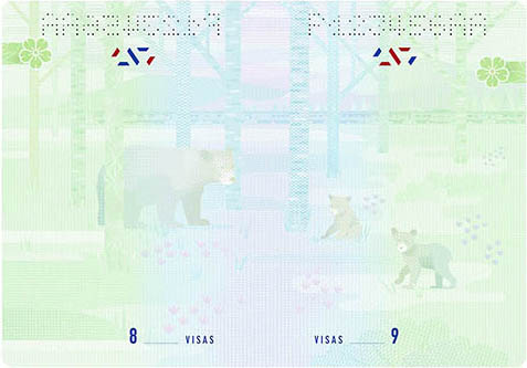 Actual Canadian Passport Art
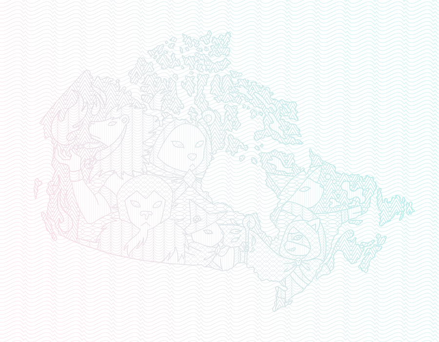 My interpretation
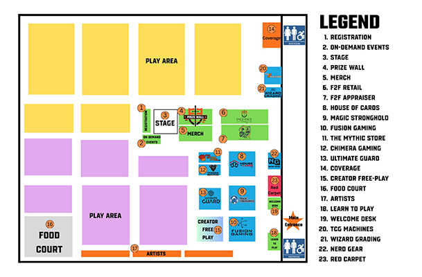
The next large part of this was tackling the map. Face to Face sent me a map but it was uhm... it looked uhm. Well I wanted a map that was more in-line with the design of the rest of the booklet. For this I had to collect all the vendor logos and vectorize them so they would look good at any size, and so I could cleanly re-color them. Some logos were easier than others and some logos needed to be rebuilt entirely from scratch. Additionally some logos were reformatted to be vertical if they didn't fit in the map space. Face to Face apperantly liked my hall map because they asked me to make a larger version for a foam core board that would sit at the front of the event hall.
 Hall Map Original
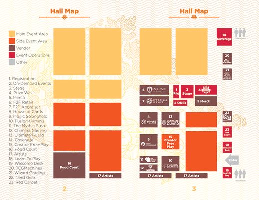 Hall Map Redesign
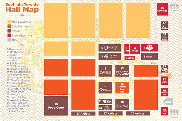 Foam core hall map
After a fair amount of back and forth with the overall contents of the book we got it to a working product. For the coverI knew I wanted to emulate the Canadian passport's gold design with its iconography. However when I got the back page design from the internal design team, I realized a dark background wouldn't really flow properly, so I modified the front cover to match the back a little more closely.
 Canadian passport front
 Internally designed back page
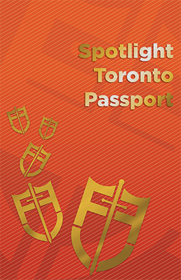 Final front page
Overall I wish I'd had some more time to spend on this, the short timeline of this project meant I didn't get to refine some of my ideas quite as much as I wished I could. The front cover I feel falls a little flat and I think the inside could've used a bit more of a bold overall feel. As it is I feel like the design is a little dantier and more delicate than it should've been for this kind of thing. Even so I think the overall presentation of the booklet is pretty strong and I'm happy to include it in my portfolio.
Full booklet
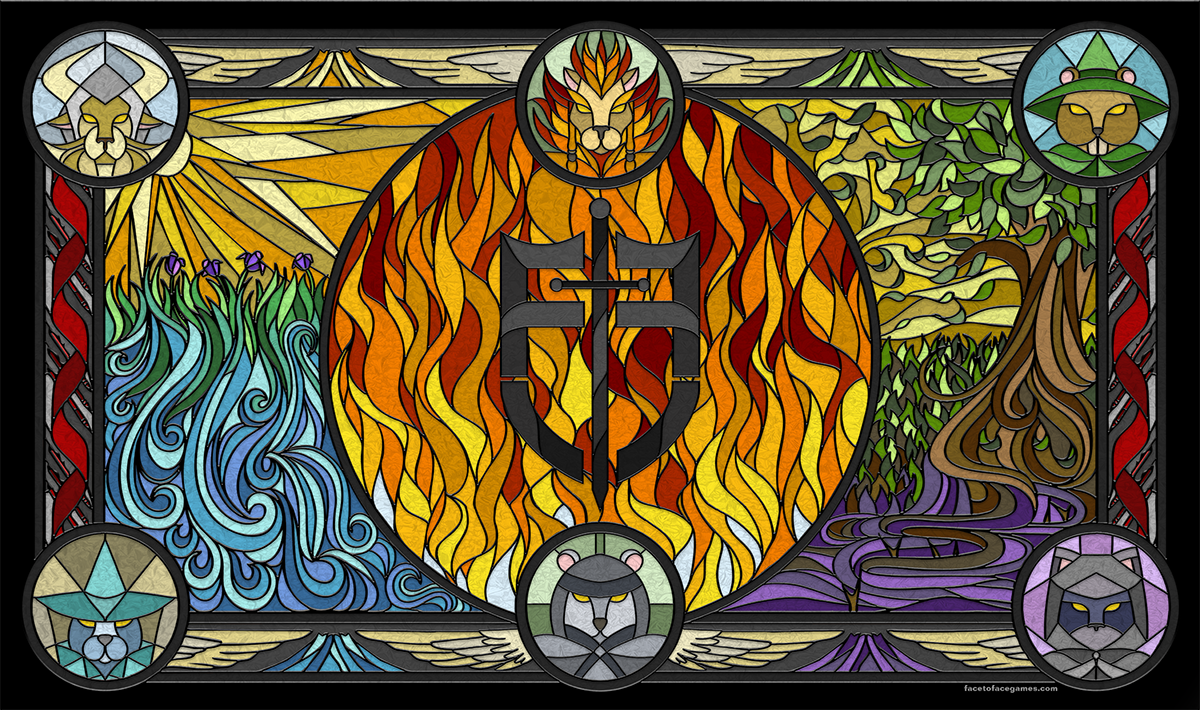
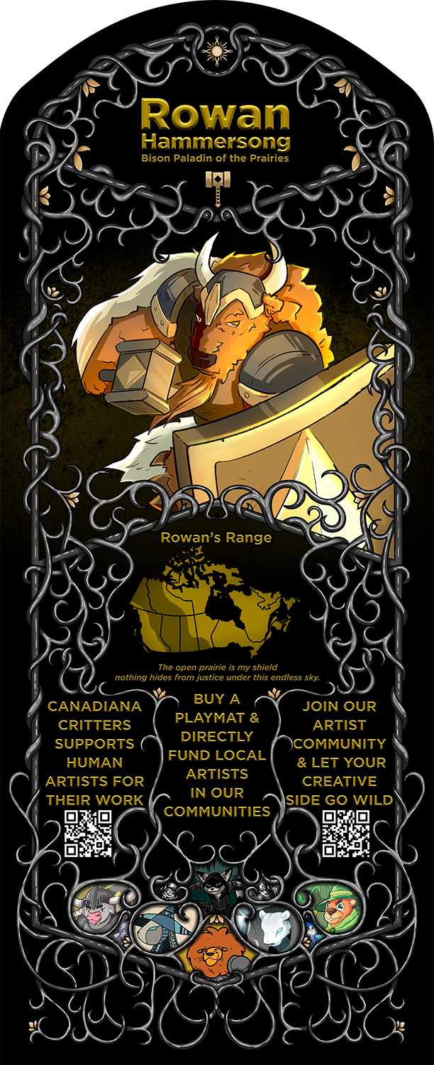
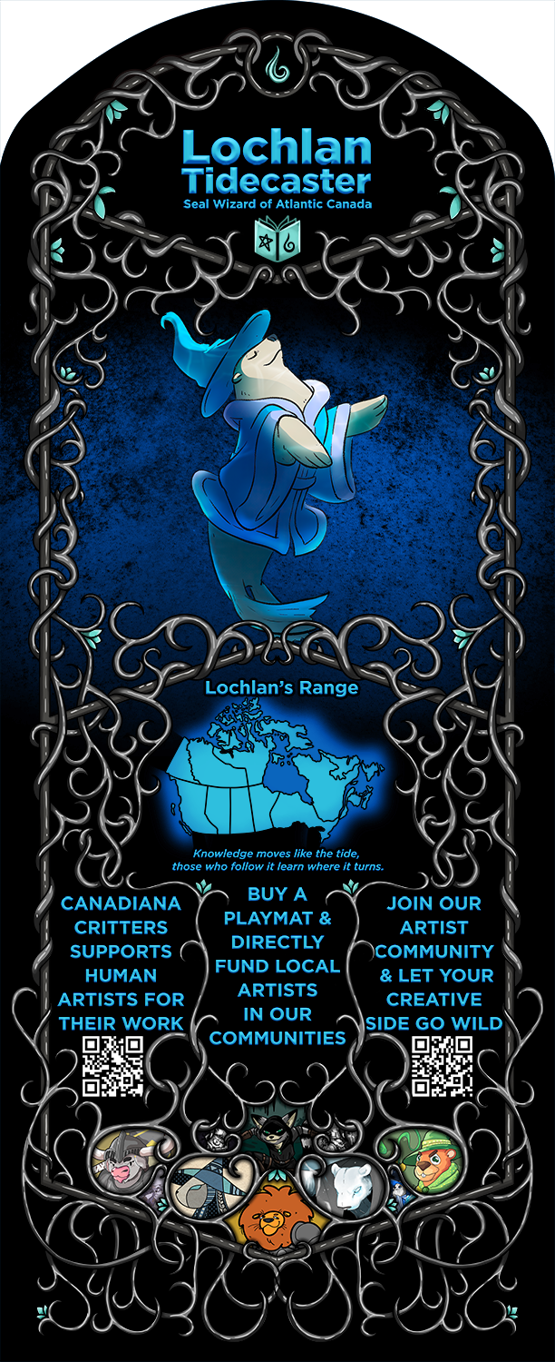
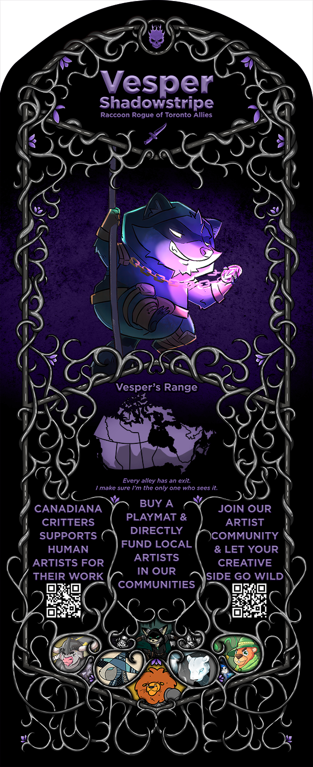
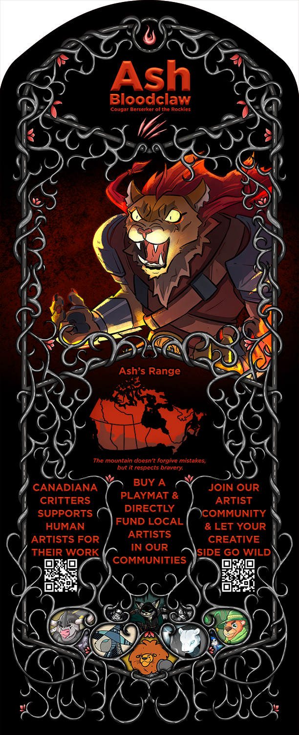
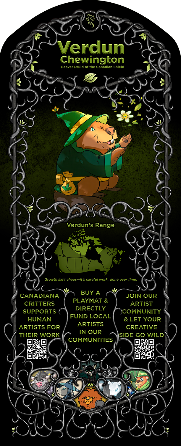
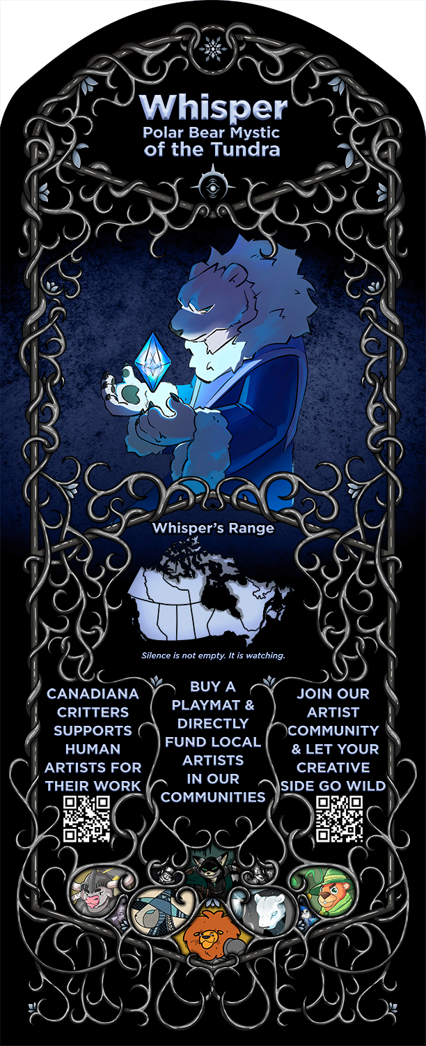
Artistic Playmats
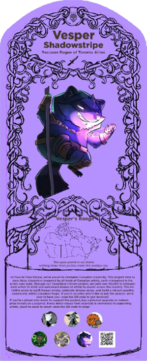
Because the previous playmat design was quite sucessful, Face to Face let me know that they'd be happy to have me design another playmat for them. I had a few ideas. My first was a playmat featuring their animal mascot characters but in a style similar to the map of canada, a minimalistic black and metallic design. I wanted to play a little closer to the filigree aesthetic of my bird playing cards though. In my mind I wanted it to be printed with gold or metallic ink, to really give it that extra-premium feel. There weren't any iterations of this because it was kind of just a "we will take artwork that you give us" situation.
I spoke about this design in my Judge Foundry article, but originally this was a playmat design for Judge Foundry, initially it only featured four animals, and as Judge Foundry didn't have animal mascots, I just picked four that felt judge related (Community - wolf, Excellence - lion, Justice - owl, and Fun - otter), but luckily Face to Face does have animal mascots, so it was easy to figure out who to put in the corners, the problem here was that there were six mascots, not four, so I had to create a few more bubbles to incorporate the extra animals.